[ CYPHER CODE #1275 ]
The original Brawny man looked like a real guy. The new one looks like a mockery of masculinity.
[ CYPHER CODE #1276 ]
When masculinity was normal, advertising showed ordinary men. Now, it's a parody.
[ CYPHER CODE #1277 ]
Modern marketing shows realism for women and caricatures for men.
[ CYPHER CODE #1278 ]
The old Brawny man sold reliability. The new makes the male ego a punchline.
BRIEFING
Jett here. Somewhere between the 1980s and today, the Brawny paper towel guy went from being a normal everyday man to a cartoon lumberjack that looks like he just escaped from a Beauty and the Beast "Gaston" casting call. Why did this happen? Well, sit back and I'll tell you. Let’s get into it.
SOURCE

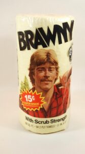
If you go back and look at the original Brawny packaging from the late 70s and 80s, the man on the roll looks like someone you would actually run into at a hardware store. He’s handsome, sure, but he’s 100 percent recognizably human and totally normal. The kind of guy who might work construction, drive a pickup, or help a neighbor change the oil in his car. The whole point of the character was real-life reliability. He wasn’t a superhero. He was just a dependable everyday man. The guy next door, if you will.
Sure, he was out in a forest with an axe slung over his shoulder, but he had a solid, healthy male build, and his face looked as all-American as it gets.
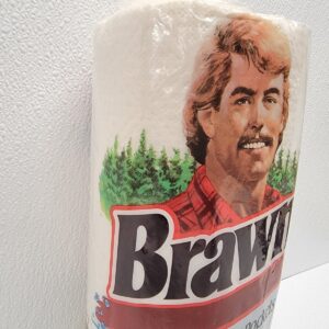
SOURCE
There were a few variations of the character over the years. After all, times change. But one thing that never changed was his relatability and that strong, steady sense of sensible alpha-male authority.
SOURCE
These versions of the Brawny man worked because masculinity at the time didn’t need to be "controlled" through criticism, mockery, and attacks. It was simply assumed. Men are men and thank God for that. Advertising portrayed men who looked ordinary, capable, and grounded because that's who they were. Nothing was controversial or complicated about telling the truth.
But oh, how times have changed. Now look at the modern version.
SOURCE
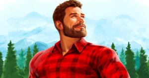
The jaw is sharper. The beard is sculpted. The chest is inflated to almost comical levels. The proportions look less like a human being and more like something out of a video game or a Disney movie. Instead of resembling someone you might actually know, he looks like a corporate designer’s exaggerated idea of what a man thinks he looks like. It reads less like realism and more like quiet mockery. As if to say, “We know men aren’t relatable or human anymore, so we’ll just replace the real thing with a ridiculous caricature.”
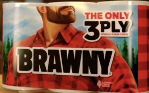
But now the packaging has gone even more off the rails. Instead of the full image, you just get a cropped portion of his face, like he’s only there out of annoying branding obligation. It almost feels like they’re keeping him around for the sake of recognition while pushing him out of the frame. It’s like they're saying, “Don’t worry, ladies. We know he’s a POS, which is why we decapitated him.”
This once larger-than-life mascot, the rugged flannel-shirted woodsman who was supposed to embody strength and reliability, has now been reduced to half a mug on a roll of paper towels.
SOURCE
This shift reflects a deeper cultural change in how masculinity is portrayed. When a society is comfortable with men, it depicts them casually and normally. But, when a society becomes threatened and viciously angry about masculinity, it turns men into symbols or caricatures. Because at that point, they're not even worthy of "human being" status. The traits get exaggerated and mocked, the body becomes stylized, and the character turns into less of a person and more of a visual shorthand for “strength,” a bit like a Disney character.
And we know this is the goal, because the brand has been desperately trying to soften the masculine images in other ways, too.
In recent years the company rolled out campaigns declaring that “strength has no gender,” even placing women in the same red flannel shirt traditionally worn by the Brawny man. The messaging suggests that, surprise, it turns out the lumberjack archetype wasn’t really about men at all. It was about some universal idea of strength the whole time. Who knew?
SOURCE
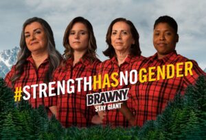
They admitted their goal was to move away from the “male is strong” messaging and dive headfirst into the DEI cesspool:
SOURCE
But something really obvious happened when they tried that.
It didn’t land.
Because people are sick and tired of the woke nonsense. The Brawny brand spent decades building its identity around masculine reliability. And that's perfectly okay. But when you try and turn that symbol into something weirdly "gender-neutral" while still exaggerating the male version into a cartoon, the entire thing becomes parody.
Not to mention, Georgia-Pacific, which owns Brawny, is a subsidiary of Koch Industries, which is supposed to be (cough, cough) a conservative group. But they’re not. They’re establishment right-wingers, which these days is basically the same thing as being on the left.
Modern advertising loves to portray women as realistic, relatable individuals while men are presented as exaggerated, goofy types. The female characters look like everyday people. The male characters look like clumsy mascots. Realism on one side. Caricature on the other.
That doesn’t mean every marketing team is consciously plotting some sinister cultural message. But it does mean branding will regularly mirror the mood of the moment. And right now, that mood is "cancel culture" of the male species.
DEBRIEFING
The Brawny man still has to represent strength because the product depends on it. It's the name, for crying out loud. But he can’t simply be a normal man anymore. Not in today's "toxic masculinity" environment. So now, he's become something safer for modern branding. An AI-generated exaggerated lumberjack with a perfect beard and superhero proportions, who reminds women more of an LGBTQ "bear" than an everyday man.
He’s not a real person, so there’s no reason to feel afraid or threatened.
He’s just a joke, a mockery of what men are supposedly meant to aspire to.
Today's Brawny man is a carelessly designed version of masculinity that feels big enough to sell paper towels but abstract enough that nobody has to ask uncomfortable questions about what it actually means to be a man.
NOW YOU KNOW
Even a paper towel mascot isn’t safe from corporate DEI.
Share your opinion
COMMENT POLICY: We have no tolerance for comments containing violence, racism, vulgarity, hard-core profanity, all caps, or discourteous behavior. Thank you for partnering with us to maintain a courteous and useful public environment!
Agreed! The Femi-Nazis have anti-man words, like “toxic masculinity” and “mansplaining”–and EVERY GD commercial shows men as dumb klutzes, while the wives are always smarter and corrects him while she’s belittling him–and he smiles in agreement! The Femi-Nazis wouldn’t accept being in the man’s position in commercials, probably because nearly all TV crap is written by women. BTW, I use the term Femi-Nazi because it explains their anti-male gender bias; no other viewpoint than the feminine is allowed. Thanks, Rush Limbaugh, for inventing that word!
All Bra and they took the knee. Bye cucks, no longer buy-ing.
I can’t wait for the Big Michael Obama on the label. Collector’s item.
The new Brawny dude looks like a democrat